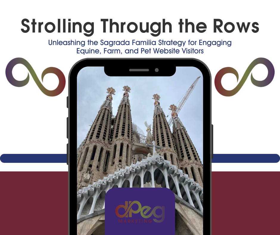
During a recent journey to Barcelona, I wandered under the expansive spires of the Sagrada Familia, Antoni Gaudí’s breathtaking yet unfinished masterpiece. The basilica, with its stunning blend of gothic and curvilinear Art Nouveau forms, encapsulates a choice in exploration: guided tours or an individual, audio-guided adventure. Opting to meander solo, it struck me how this mirrors how folks might roam through a website about your farm, equine, or pet business. Let me walk you through my idea of creating a website like a guided tour.
Related: Navigating the Future
Take Your Visitors on a Digital Tour
Imagine your website as an unfamiliar attraction. New visitors are just like first-time guests—they can follow a well-marked trail or venture off the beaten path powered by curiosity. The way we lay out our site’s copy and structure can either corral them towards the essential info like services and contact details or let them discover the hidden nook where the best apples fall—these are your blog posts, in-depth service descriptions, and the tales behind your brand.
Getting this mix right makes a website as memorable as a grand piece of architecture. The Sagrada Familia isn’t just a visual spectacle; it draws folks in to interact with its history and artistry on a personal level. Similarly, a finely honed website doesn’t just present facts; it crafts an experience. Visitors will recall their visit not just because they found what they needed but because they stumbled upon something that genuinely resonated with them—something that made them linger.
Architecting Your Audience Experience
Think of your web design team as an architect but for online experiences. Writing for the web requires a blend of structure and flair. Your website’s copy should act like a doorway, wide open and beckoning visitors to come in and explore. It should ignite curiosity, offer clear signposts to information, and allow for deep, engaging explorations. The trick is weaving informative and engaging elements together so that every line of copy serves a dual purpose: guiding the visitor and inviting them to uncover the hidden gems of your content organically.
In this digital age, where content is plentiful, and attention spans are short, your website needs to stand out like a Gaudí masterpiece. It should captivate the imagination and offer more than just a glance, much like a lone explorer in the Sagrada Familia discovering the intricate beauty of a stained glass window that the guided tour merely breezed by.
Enrich the Journey
As we intertwine the structural with the experiential in our writing, we cater to the immediate needs of our site visitors while building a memorable presence that compels them to return, delve deeper, and ultimately embrace our message. Let creating your website be an exploration, an enriching journey as captivating as a day spent wandering through the most iconic barns and pastures.
Creating a website to delight and inform visitors.
dpeg Marketing Company has 2 spots open for website design in 2024. Schedule a consultation to learn more.
We partner with tiny house, agriculture, agritourism, brewing, pet, and equine businesses to help them grow. We can help you optimize your site and integrate the essential tools. You can build your reputation and be recognizable with the right systems.
Maximize your marketing spend by consolidating your email marketing, blogging, social media, and website maintenance with dpeg Marketing Company. We have 4 spots open for marketing partnerships in 2024. Access our calendar to schedule your FREE consultation.
Contact us for a FREE consultation by emailing teona@dpegmarketing.com or calling (828) 333-3816.

